ShopDreamUp AI ArtDreamUp

Deviation Actions


Suggested Deviants


Suggested Collections


You Might Like…


Featured in Groups


Description
Hey, guys. So do any of you remember that old summer project I promised you guys last year? I finally got around to it. It's only been, what? a year? It's all good. LOL
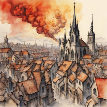
So.... yeah. This is my vision of the streets of Canterlot- if it were to be built by French architect ponies. I think it's the perfect compliment to Canterlot; the street cafes, cobblestone, even the little gargoyles/ statues are in the show. I had a lot of room for interpretations for this piece thanks to the ambiguity in the visual stylings of the show. Though I do feel I abused the liberty a bit, seeing how the only things that make this recognizable as Canterlot are the towers, the cafe seen in the S2 finale and "Sweet and Elite", and Pony Joe's. Meh, whatever. I'm still happy")
This is actually the first piece in a looong time of which I am truly satisfied with the outcome. I've had so much fun drawing this, it's silly I also found my .3 mechanical, which really helped a lot. You'd me surprised by how much of a difference of .2mm can make.. it's ridiculous!
Completion time~ 58 hours over 2 weeks. Crushed my old record!! It sure payed off in the end, I gotta say. I sure hope you like it as much as I do. (Smile)")
So.... yeah. This is my vision of the streets of Canterlot- if it were to be built by French architect ponies. I think it's the perfect compliment to Canterlot; the street cafes, cobblestone, even the little gargoyles/ statues are in the show. I had a lot of room for interpretations for this piece thanks to the ambiguity in the visual stylings of the show. Though I do feel I abused the liberty a bit, seeing how the only things that make this recognizable as Canterlot are the towers, the cafe seen in the S2 finale and "Sweet and Elite", and Pony Joe's. Meh, whatever. I'm still happy
This is actually the first piece in a looong time of which I am truly satisfied with the outcome. I've had so much fun drawing this, it's silly
Completion time~ 58 hours over 2 weeks. Crushed my old record!! It sure payed off in the end, I gotta say. I sure hope you like it as much as I do.
Image size
4197x3279px 31.51 MB
© 2013 - 2024 josh-5410
Comments208
Join the community to add your comment. Already a deviant? Log In
Excellent composition and lighting. Fantastic attention to detail, too! However, your perspective is pretty off. For example, the three tables all have the same angle to them, and the building facade facing the camera on the left is skewed incorrectly to the right and tapers off too much at the top.
Be more cautious and studious with your perspective. Look at picture of Paris or Prague as inspiration and reference, just to get the angles right. The tables should all have different angles to their tops, since they are closer to the camera and therefore more subject to perspective.
All of the elements are there. Perspective is just off.